Sidor

29 May 2011

Franka in Progress

I’ve been quiet about Franka for a while, but now I want to return to her. The printout has been hanging on my wall in exactly the same state as it was in the last time I mentioned it, just over a month ago. I figured that it would be fun to share with you the process of how she develops from a frame in a comic album to a wall quilt. I have an idea about what I need to do to get the result I want, but there are many design issues (known as well as unknown) to solve along the way.

For this project, my greatest influence is a textile artist called Pam RuBert. She makes humorous wall quilts with her alter ego Pamdora in the funniest situations. Her quilts always make me laugh. So I’m going to study her techniques for fused raw edge appliqué to help me resolve some of the issues with my Franka quilt. It will be a learning process. I’ve probably jumped in off the deep end again, but never mind. It makes things more exciting.

Starting from the beginning, what I’ve done so far, is, firstly, to scan the image from the comic album with as high a resolution as my scanner could manage (1200 dpi). I then determined the size of the finished quilt (70 x 74 cm / 27” x 29”) and printed the scanned image in full size and greyscale. The printout was 15 A4 pages, which I joined together with sticky tape.

The next step was to determine the different design elements in the image, and to draw them in with a permanent marker. My aim is to be as true as possible to the original, but in some cases I need to simplify or alter the image to make it work with fabric. I also decided that I wanted more space around her hand on the left side of the image. This meant that I needed to add more lines to the flowers above that hand. At the same time I also made some other alterations that I felt were needed.

I’ve used permanent markers and a white gel pen to define the design elements. I want the lines as sharp as possible, as that will help me when I’m making the templates for the fabric pieces. The process of filling in the lines is a bit tedious, but essential, because it forces me to make decisions that will help me with the templates later. A drawback with markers, though, is the fumes. I’ve kept a window open beside me to make sure the room is well ventilated. It’s also a good idea to have a scrap piece of paper underneath, as the markers easily bleed through the paper and stain your work surface (in this case my kitchen table). The white gel pen is for correcting mistakes that I make while marking, for removing lines in the original that need to be left out, and for creating more contrast in less well-defined areas.

When I’ve finished defining the design elements, I’ll start thinking about templates and fabric. I’ll keep you posted on my progress.

Defining the design elements with permanent markers and a white gel pen. 
I moved the border and redrew the flower to the bottom left.

25 May 2011

You Gotta Fight

In my previous update I promised you more to come. I had bought a plain white t-shirt that I wanted to jazz up. Well, perhaps ‘jazz up’ isn’t the right expression when you’re alluding to Beastie Boys. Pimp is really the word I need to return to. First, I must confess that I didn’t come up with this idea myself. I saw the text on a t-shirt in a shop and thought it was brilliant. It didn’t come in my colour, though, so I decided to DIY it.

Now I just have to wait for the weather to warm up enough for me to be able to wear it without turning blue.


Here’s how I did it:

1. If you’re going to print on a t-shirt you need to wash it first to get rid of any chemicals that might interfere with the paint.

2. I designed the text in black block letters with the help of a computer and MS Word (font: Stencil), and printed it onto plain printer paper. I drew the arty letters freehand.

3. I traced the text onto a paper called ‘Magic paper’ (similar to freezer paper) and cut the shapes out with a craft knife. Remember to use a self-healing mat to protect your surface. Or use scissors.

4. I then ironed the paper to my t-shirt, put a piece of cardboard inside the shirt to protect the back of the shirt from paint and applied the black textile paint with a foam roller.

5. I used a smaller foam dauber for the arty letters and applied two coats of paint: one purple and one metallic gold to highlight certain areas.

6. When the paint was dry I ironed the print to set the paint.

Cardboard, printout and stencil.
 I removed the stencil carefully, so I can reuse it for another project.

21 May 2011

The Hunters Return

My Mum is over for a visit this weekend. She’s going to participate in Naisten Kymppi, which, according to their website, is ‘Finland’s biggest sporting event for women’ with 18 000 women of all ages who run, jog or walk a distance of approx. 10 km (6 miles). Originally, I were to participate too, but because of my injured foot I’ll just have to step aside this time. I’m pretty disappointed, as it has been one of our Mother-And-Daughter-Things, but there’s not much I can do about it.

Mind you, today’s shopping spree is probably equivalent of a 10 km walk. Mum wanted to shop for clothes, so off we went. Four and a half hours later this hunter returned with sore feet, aching back, a blister on a toe, low blood sugar and the gait of a zombie. My limit is normally something like 2 hours (every six months), so this was well past the threshold of pain. But – I brought home some good loot! I won’t bore you with the details, but I did buy a plain white t-shirt to pimp, so stay tuned for more to come.

And, as if the shopping wasn’t enough for my poor foot, after dinner we went for a wee walk. Tadpole Patrol has been neglecting its duties lately, so it was time to check up on the little rascals.

 According to a chart I found, they’re probably about 4 weeks old. I hope the puddle doesn’t dry out before they’re ready to hop away. Fingers crossed!

 I live in the City of Helsinki. This is my neighbourhood. It's hard to believe, isn't it? (No, I don’t live in the little red house.)

15 May 2011

Going bananas

I had fun yesterday, making this cool banana-peel pencil case. When I saw it in the spring 2011 issue of Stitch magazine, I knew right away I was going to make it. Not only because it is constructed in such a fun and unusual way, but also because it’s just what I need. I’m tired of having to root around in my pencil case in order to find the pen with the nib size and colour I need. What I find so nifty about this pencil case is that it is standing up and you literally peel away the fabric to reveal all your glorious pens in a nice little bunch with their sizes in plain sight. Excellent!

Banana pencil case about to be peeled:


This appeals to me:

14 May 2011

Spread the Word

Today I want to tell you about a Clever Tool. Last autumn I came across some pretty funny-looking brushes that stopped me in my tracks. They weren’t really brushes, because instead of bristles they had a shaped tip made from silicone, and they were called clay or paint shapers. Now, I didn’t have a clue about how I would use them, but they looked like Something That Might Come In Handy For Something. They were pretty cheap too, so I bought them – and forgot about them.

Silicone clay or paint shapers

Much later I was watching an episode of Linda and Laura Kemshall’s Design Matters TV (the episode Watercolour Tricks), and there Linda offered this excellent tip: you can use rubber shaping tools for applying masking fluid. That was very interesting news to me. About the same time that I bought my shaping tools, I had also had a go at masking fluid. The question of how to apply the fluid was still open though. I had ruined two brushes, and I didn’t like wooden sticks. So this tip sounded promising. But I didn’t try it at once – and forgot about it.

When this month’s theme for the Sketchbook Challenge (Can’t Resist) was announced, I knew right away that the time was ripe to put Linda’s tip to the test. And I’m more than pleased with the result. The different tips on the tools make it easy to create a variety of marks with the masking fluid, and it was really easy to remove the masking fluid from the tip: wet or dry, it just peeled away with a light wipe. So if you haven’t tried this already, I recommend that you do. It certainly has made the use of masking fluid less problematic for me.

Here’s an example of some of the shapes that I quickly masked out with the help of my shaping tools. You can see the whole page on Flickr.

11 May 2011

What a bummer

I twisted my ankle today at the gym. Second time in 15 months. Not good, not good. But at least I've heard about RICE this time (rest, ice, compression and elevation), so lets hope I manage to reduce the damage. Very inconvenient, I have all sorts of things planned.

C'est la vie.

 (Aaaaaaarggggh)

8 May 2011

Blast from the Past

I couldn’t resist updating my blog twice today. After I’d finished my first update, tidied up my mess, phoned my mother (Mothers Day!), had lunch and done a preliminary spring cleaning of the balcony, I decided it was time to go on an inspection round to check out the tadpole (Swe: grodyngel) situation. It’s a glorious day, so I figured that I’d cope with my summer jacket. I got it out, put it on, put my hands in my pockets, and found a folded piece of paper. Assuming it was an old shopping list, I unfolded it to see what it said before I threw it away. Then I started grinning like a Cheshire cat, because it wasn’t a shopping list. It was a message from myself to myself, which I had put there 8 months ago, before storing away the jacket for the winter. This is what it said:

It’s SPRING

P.S. The tadpoles looked fit and lively ♥
Experience is what you get when you were expecting something else

Almost a year ago I bought a cool footstool. I didn’t care much for the fabric, but the wooden frame had potential. As soon as I saw it I knew that I wanted to pimp it Alabama Chanin Studio Style.

The original footstool:


There have been various vague Alabama Chanin-related plans brewing in my head for some time. And this Friday I couldn’t hold them back any longer. I had to go and get myself some jersey and pimp that stool of mine NOW.

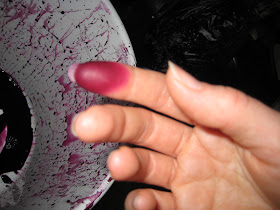
Off I went to the fabric store. Not surprisingly, I couldn’t find all the colours I wanted. That’s when I decided that if I can’t find it, I’m just going to have to make it myself. I had dyes that had hung around for a while and that I’d never tried before. What a great incentive to get started with them. Without further ado I threw myself into it. Read about the mess here.

And the result?

I got a very nice blue-purple:
Problem?
What happened to the red-purple that appeared on my scrap when I dipped it in the dye to test it? I tried to follow the directions closely, but it seems that something went wrong in the process. No matter how long I kept rinsing the fabric, the water just didn’t run (even relatively) clear. I know I made too much dye solution, and added more fabric to it to avoid waste, but surely any excess pigment should rinse out quite easily, shouldn’t it? I’m starting to suspect the fixative, or even the dye itself. Perhaps the dye was old? As I said, I was expecting a purple that would lean more towards red than what I got. I also noticed while I was rinsing that the water was more pink than purple. Could it be that there was something wrong with the red dye so that it didn’t fix?

Well, I got a very nice violet, which I’m sure I’ll make good use of it (with a note to self that the fabric isn’t necessarily 100 % colourfast). However, in combination with the two red store-bought fabrics I got for the footstool, it’s not the right colour. I don’t like it. Well, that’s not the truth: I do like it – it’s got oomph, but it’s not right for what I had in mind this time. So I thought of Liz Lochhead’s poem again: If the rhythm’s not right, it’s not right… Rewrite. I rummaged around in my stash and pulled out the jersey I used for the bandana. It’s not as bold a choice as violet, but it brings the harmony I’m after.


The bolder combination with violet (yummy, but for another time):

My choice this time (the photo doesn't do it justice):

Yum! I love it!

And if I change my mind, it’s quite easy to remove strings and replace them with another colour. Very convenient. I’d love it in white and beige too. And I want a matching pillow on top. But that’s for another day.

I hope I won’t have to tie another knot for the rest of the weekend. I just have to pick shoes without laces when I go out to enjoy the sunshine.

6 May 2011

Making a Mess

For reasons I will get back to soon, I decided that tonight was THE night when I was going to experiment with some fibre-reactive dyes that I’ve had in my cupboard for a while, but never tried yet (Finnish-produced EMO Tuotanto). The dyed cloth has to batch until tomorrow, so all I can say for now is that I’m glad my kitchen rug is dark brown, and that I had enough foresight to wear old clothes. I tried to be ever so careful, but there was some splishing and splashing as I turned the cloth around in the dye bath. Splish – and I had decorated my trousers. Splash – and I had a top to match. The biggest surprise, however, was when I removed my protective gloves and discovered that, apparently, there is a hole on the index finger of the right hand glove.

 It’s a good thing that I love purple.


 My gloves are apparently too short.

 Oh, happy mess! Oh, happy weekend! Stay tuned for more to come…

4 May 2011

Of mermaids

It’s cold in Finland again, after a warm spell around Easter, and it’s cold in my office, and I'm cold, and I want to be back in Thailand. A song by Finnish musician J. Karjalainen has been spinning in my head for days:

Uu-laa-la-laa-Ulappaa
Aallot laivaa keinuttaa
za-za-zaa za-za-za zaa-laa-la-laa
Pinnan alla
Meillä oli hauskempaa
Merenneitoni ja minä

My attempt at translating the text into English (I'm sorry that the play with sounds didn't translate very well, so it'll give you the meaning, but it's not very poetic) will explain to those of you who don’t understand Finnish why this song has become an earworm for me:

Oo-laa-la-laa-Open sea
The ship is rocked by the waves
za-za-zaa za-za-za zaa-laa-la-laa
Beneath the surface
It was more fun for us
The mermaid and me

Here’s a link to the song, if any of you who are unfamiliar with Finnish pop culture would like to listen to it. It’s a narrative song about a man (apparently the musician himself), who’s invited into the sea god Ahti’s kingdom by a mermaid. (Ahti isn’t at home, so it’s ok.) The song was also spinning in my head when I was snorkelling. I like the silly lyrics. I’m fond of a lot of silly things.


This ink drawing is based on a mermaid I did a while ago. I drew it on tracing paper this time, and modified certain details. The next step is to collage it down on a suitable background.