19 December 2015

Paper Fabric Christmas Fun

One of the many materials that I enjoy working with is what I call paper fabric. It's not paper and it's not fabric, but a combination of the two. The basic technique is pretty simple: you saturate a piece of cotton with diluted PVA glue and then add papers to it. Thinner papers work best, and I like to combine papers that I've bought or found with papers that I've decorated myself.

A selection of tissue paper with stamped and hand drawn patterns


It's wise to prepare all the papers in advance, because the technique is quite messy and it's difficult to tear paper with sticky fingers...


The most difficult part is waiting for it all to dry...


A sheet of paper fabric ready to be used. It's difficult to describe: it's a bit like card stock, and a bit like artificial leather or plastic and a bit like birch bark. It's stronger than paper and you can sew it by hand or machine.


When I first started making paper fabric I used it mainly for card-making:


but later I've discovered all sorts of other uses for it. This time I set myself a challenge to use it for a variety of Christmas decorations.

I cut it into strips and made a Froebel star


As I realized that both the front and the back of the paper fabric would be visible, I painted the back with white acrylic paint. The star looks quite different when you turn it around.


I also made a woven heart basket, and realized that weaving thin strips like this is pretty challenging.

If you want to make life easier for yourself, you can skip the basket and make the heart two-dimensional instead.


This round little ornament is quick as well as cute.


But my favourite has to be the pod! (I made a pod last year too. Perhaps I should make a new one every year?)


I thought it'd be fun to make a filigree candle wrap too, but of course this is only for LED candles. I wouldn't want to start a fire!


And then I made a filigree ornament.


Finally, I made a little garland with hearts on a string


and festive bunting for the Christmas tree:


Of course you could use ordinary paper or card stock for these objects, but I think it's a lot more fun if you can use a material that you made yourself. I hope I've inspired you to make some festive decorations yourself!

Thanks for visiting my blog!

25 November 2015

Wonderful Light - The face and quilting

Yesterday I wrote about how I created the background for my quilt Ex Tenebris Lux. Today I’ll write about how I painted the face and quilted the piece.

I started by drawing the face with all its features in a smaller scale and worked on that until I was happy with how it looked. I then I enlarged the sketch to full scale and did some serious thinking about how to deal with the face in the quilt.


I decided to be brave and hand paint the face in quite a naturalistic style. In order to get an idea of a suitable colour scheme and colour placement, I copied the smaller sketch into a sketchbook and painted it with watercolour first as an exercise – going straight onto fabric would most likely end in a waste of time and paint. I knew that painting on fabric is very different from painting on paper or canvas, but still it turned out to be a great deal more difficult than I expected. Fabric soaks up paint eagerly, which means that you can’t really push the paint around much and create soft blending, and you run a risk of getting uneven coverage as the paint dries with a crisp edge in one area while you are working in another. You need to be quick when you paint larger areas. This was the first version of the head, before I painted the facial features. I used freezer paper for pattern transfer and to stabilize the fabric when I was painting, which is why the fabric looks wrinkly.


One of the greatest challenges was the colour of the face. I knew that paint lightens as it dries and that the silk organza that would form the final layer also would lighten the colour, so I had to take that into account as I was mixing the skin tone (no chance of finding a ready-mixed skin tone!). However, when the paint was dry I realized that the colour was too dark. I hadn’t taken into account that the first layer of paint needed to be very light, as it would form some of the lightest areas in the face and that I would add darker tones when I added shading. This is where I had my first moment of slight panic. I had spent so much time paiting the head. Would I have redo everything?

I slept on the matter and then it happened: the thing that I love as a creative person. The Solution. The Lightbulb Moment. The Eureka! I get such a rush from solving creative problems. I didn’t have to paint it all again: only the face! It’s fabric. It's appliqué. It’s all going to be covered up and smoothed out with organza. Everything can be fixed. So I painted another version of the face, cut out the hair and jacket from the old version and applied that onto the new face with the help of fusible web. How’s that for a facelift!


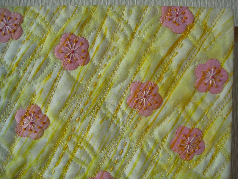
I then fused the whole head onto the background together with some falling ume (plum) blossom, and added more paint for highlights and golden light falling on the skin.


Now that everything was in place, it was time to paint the silk organza. I stretched it in a wooden frame and placed the frame over the face and the background, which I protected from drips and spills with plastic sheeting. The reason for this arrangement was that I could now see the quilt top underneath the organza and knew exactly where to paint. When dry, I also monoprinted a light texture for added interest.


I was now ready to start quilting. I was quite nervous about the face so after I’d sewn the outline of the profile and the ear, I continued with the hair decoration, hair and falling blossoms. And then I had my second moment of slight panic. How on earth would I quilt the face? I did a bit of research on how other quilt artists have dealt with faces, and came to the conclusion that I would not attempt any kind of realism here. No topographical lines, or shading with thread. Instead I would go for symbolism. I started with some simple patterns on the neck to feel my way, and when I was sure that I was on the right track I turned to the scariest part of the whole process. Quilting the face. I picked a leaf pattern and let it loosely follow the contours of the face. What a relief when the final stitches were in place!

I often use masking tape to as a stitching guide


After this everything else was, if not a piece of cake, then at least not as nerve-wracking. For the background I chose three themes for the quilting: the 
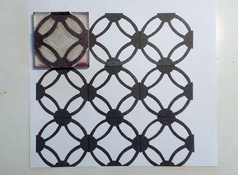
maru shippo pattern, the ume blossom and rays of sunlight. For me the quilting is just as important as the main motif in an art quilt and it should always add another layer to the story of the quilt.


As a final touch I like to finish with hand stitching as it adds yet another dimension to the quilt and creates life and depth.


I hope you enjoyed reading about my process even though this blog entry was very long. Making the quilt was also a very long process. I poured my heart and soul into it and therefore it feels wonderful that all my effort was recognized and rewarded.


Thanks for reading!

24 November 2015

Wonderful Light - Making the background

Two weeks ago I promised I'd be back with more process images of how I made my award-winning quilt Ex Tenebris Lux. I realised that it's quite a long process, so I've split it into two parts. This is the first part, which is all about how I made the background fabric.

I already told you that the quilt was inspired by a page in one of my art journals. If you remember the image you may also remember that it had an Asian feel to it. Regular readers of this blog will have noticed that I've been inspired by Japanese design for the last two or three years.

There are two areas of Japanese design that I'm particular inspired by: shibori dyeing and sashiko embroidery. In the quilt I looked to sashiko for inspiration when I needed something to bring interest into the background. I found a sashiko pattern called maru shippo, which contains circles and is therefore connected to the sun as the circle is a Japanese symbol for the sun. It felt perfect for my quilt, and I began by making a maru shippo stamp and stencil for the background.


The reason I made both a stamp and a stencil was that I wanted to have a dialogue between darkness and light as well as positive and negative printing. In other words: my palette of choices for texturizing the background was to print with a colour that was darker or lighter than the base fabric and with a tool that let me print a positive image (the stamp: the motif has a different colour) or a negative image (the stencil: the background has a different colour). I used textile paint in both a thick and a thin consistency. Thick for printing, thin for spraying. The finished background looked like this. I knew the middle would be covered by the figure, so I didn't worry too much about that area.


The base layer was painted wet in wet with silk paints before I printed it, and I used a wooden frame to stretch the fabric prior to painting at that stage.

The background formed four main areas in my mind: shadow, light and two areas of transition.

The shadow

The transition from dark to light 

Light

Light defeating darkness

That was a bit of information about the background layer. Next time I'll show you how I painted the face and tell you a little about the quilting process.

Thanks for reading! See you again soon!

10 November 2015

Wonderful Light

I am thrilled and happy to announce that my latest art quilt, Ex Tenebris Lux ("Out of darkness comes light"), was awarded first prize in the modern series in Finn Quilt's (the national quilt association of Finland) national competition this autumn. The theme was "Ihana Valo", which is Finnish for "wonderful light" – a topic that is always current in a country so far north, where we either have light in abundance in the summer, or hardly any in the winter. The return of the light in early spring is the return of life in many ways. Not only as an awakening of nature, but also of the spirit. The dusty winter curtains of the mind are pulled back and light floods in. Hope grows. Energy levels rise. Eyes are opened to a new world in colour.


This is the first time I've entered a juried competition and although I did it with the serious intention of doing my very best to win an award, I didn't dare hope to actually win. I was overwhelmed, overjoyed and grateful when I had the news of the judges' decision. A lot of work (blood, sweat and tears – not only metaphorically, but quite literally!) went into the making of the quilt. A small ink drawing I did almost two years ago, at the end of winter (likewise a spiritual winter) was the inspiration. A good reason to keep an art journal!


As you can see, I developed this black and white sketch quite a lot by changing the angle of the head and stretching out the neck to emphasize the way the woman stretches herself like a flower towards the sun, and I made her hair blonde to counterpoint darkness and light throughout the quilt.

Below are some detail shots of the quilt, and in my next blog entry I'll describe the process of making it. I created all the fabrics myself by dyeing, painting and printing cotton and silk organza, so it would be too much information to cram into one blog entry. This is the amount of thread colours that went into the quilt:


I do have an extensive collection of embroidery threads that I have built up over the years. I love to be able to spill out my threads on the floor and pick out the rainbow that I need for a particular project. I spend a lot of time auditioning colours to find the one that is exactly right, or at least as close as possible to what I want. This obsession with colour and excessive amounts of art supplies in all the colours of the rainbow has been called "rainbowitis" – a word I learned from Jane Davenport. (Check her out!)

Here are some close-ups of the face and hair decoration:


And the four corners of the quilt:


Thanks for visiting my blog and stay tuned for the next entry, where I will show you more process images.


18 October 2015

Glorious Shibori

One of the nice things about having a blog is that it makes it possible to go back in time and see what you did years ago, and to see your own progress. Before 2011 I'd never even heard of shibori: tie-dye was what I'd tried a few times and thought was fun. Then - bam! - I discovered stitched-resist shibori through Quilting Arts Magazine and fell in love. My love wasn't immediately answered though, as my first explorations into stitched-resist shibori (the 'Shibori Shrimp' as I called it) was an utter failure. Not because of the stitching, but because of the dye. But that wasn't something I realised until two years later, in 2013, when I had a breakthrough with the Emo Tuotanto dye I'd been trying to use in the same way as Procion MX dye (which isn't available in Finland). All I needed to do was to keep the dye a little warmer, and suddenly everything worked as it should. Last year I made some very successful stitched-resist shibori fabrics, but never got round to showing them here on the blog. During the past few weeks I've explored even more shibori techniques, such as clamping, capping and pole-wrapping, and now I'm ready to show you what I've been up to! Yay!

Let's start with tied resist, ne-maki. I used rubber bands on one piece.


And string on another:


The nice thing about shibori is that the fabric is a piece of art even before it's been dyed.

Stitched-resist shibori is fascinating. Who would think that this scrunched-up piece


would end up like this:

Or this bundle

would look like this:

Or this weird hedgehog

 would turn out like this:

The last technique is an example of capping, where I used both stitching and plastic to create the resist. I overdyed a fabric that I'd previously folded and clamped with clothes pegs:


Which brings me to clamping, itajime, which means that you use shapes as resists. Wooden shapes are traditional, but I used acrylic shapes that I cut myself.


Apart from this circle resist, which Dad made for me with a saw.


Isn't it cool?

I used a diamond shaped resist for this fabric, which has been dyed twice:


This technique is called tesuji shibori, and the fabric is pleated and bound. I love the simple elegance of the pattern.


And here's an example of arashi shibori, or pole-wrapping, which has been dyed twice.


As you can see I've tried a number of different techniques, but still I've only scratched the surface. I have a long list of things I want to try, so I don't think this will be the last time you'll see shibori on this blog!

Thanks for visiting!