Showing posts with label 3 Days 3 Untried Things. Show all posts

13 February 2012

Untried Thing No 3: Fabric Medium + Watersoluble Media

Here's my third and final Untried Thing for this time: combining watersoluble media with fabric medium on fabric. Again, my inspiration is Design Matters TV (DMTV), and I learned this technique from Linda Kemshall.

Combining fabric medium and watersoluble media such as e.g. watersoluble crayons and Inktense pencils can be done in different ways. In my library I also have a couple of videos where Kerr Grabowski demonstrates how to use on fabric what she calls 'fugitive media', i.e. media that wouldn't stay on fabric unless you combine them with some sort of binder. The difference between Linda's and Kerr's methods (at least in the videos I have access to) is that Kerr uses a silk screen to trap the pigments under a layer of medium, whereas Linda uses a brush. I want to try both methods, but I decided to start with Linda's. As I see it, if you draw on fabric and want to make sure that your marks stay exactly where you put them, you should use the silk screen method. However, if you want to blend colours on the fabric, you want to use the brush method. Also, with the brush method it is easy to limit the area that will be stiffened with medium to where the actual image is. With a screen the medium will also cover the areas around the image.

The technique is very straightforward. You draw an image on fabric, which has been stabilised with freezer paper, using some kind of watersoluble medium (pencils, crayons). When you're happy with the image, you apply fabric medium over it with a brush, covering the whole image and blending the colours. The medium will stiffen the fabric about as much as an ordinary fabric paint would. Here are my samples:

Inktense pencils


Neocolor II watersoluble crayons


Graphitint pencils


I haven't tried washing any of my saples yet, but I'll get to that too eventually. In Linda's tutorial she used Inktense pencils with good results.

I'm very excited about this technique as there is so much potential in it. Be still, my heart!

Thanks for visiting: I hope you too will be inspired to try this! - Annika

12 February 2012

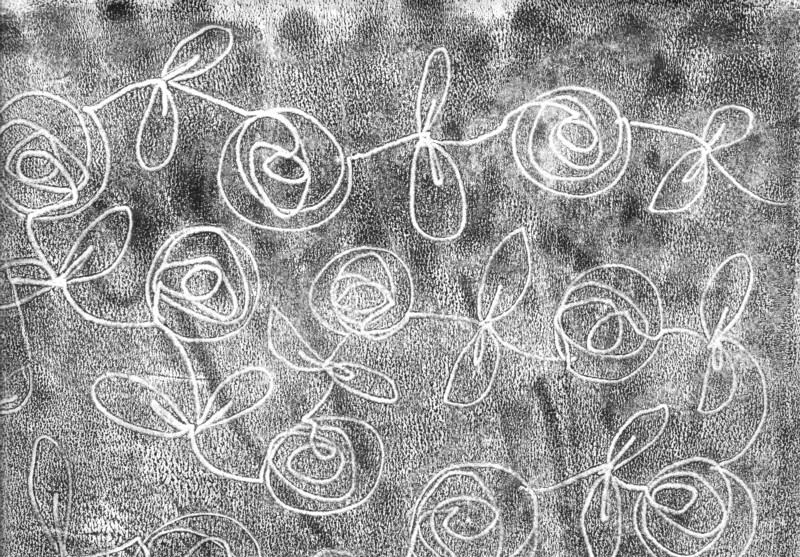
Untried Thing No 2: Drawn Monoprints

I've wanted to try drawn monoprinting ever since I learned the technique from Laura Kemshall on Design Matters TV (DMTV) quite a while ago. I went out and got the necessary acrylic retarder but, as so often is the case, I didn't have time to try it immediately and forgot about it. When I went through my stash a few weeks ago I found two (!) different brands of acrylic retarder. Apparently I'd forgotten about the first one when I went out and got the second one. Not to worry, now I have two different brands to compare. I tried them both for my drawn monoprints.

You may be wondering what a drawn monoprint is. Well, it's a cross between a drawing and a monoprint. A monoprint is a print which you basically just pull once. Sometimes you can also get a second print, which is referred to as a ghost print. In short, to do drawn monoprints, you simply ink up a printing plate (a transparency or a sheet of Perspex/Plexiglass) with the help of a brayer or paint roller. You then float a sheet of paper or a piece of fabric on top and make marks with e.g. a skewer or pencil. The marks will transfer to the paper or fabric, along with the 'background noise' that is characteristic of this technique. The acrylic retarder is important if you want to use acrylic paint, as the paint otherwise dries too quickly for this technique. Fabric paint can be used as it is.

On paper I used Winsor & Newton acrylic retarder and Liquitex Slow-Dri blending medium with black acrylic paint and both worked well. The first brand, which was a lot thicker than the other one, gave a little drier print, whereas the Liquitex medium, which was more liquidy, gave a wetter and darker print, which seemed to work better for ghost prints. On fabric I used black fabric paint. The ghost prints I tried were more successful on paper than on fabric.

Drawn monoprint with acrylic paint and W & N acrylic retarder


Ghost print of the above print


Drawn monoprint with acrylic paint and Liquitex Slow-Dri blending medium


Drawn monoprint with fabric paint


Drawn monoprint with fabric paint


I love this technique. It's easy, perfectly addictive and gives great results. Try it!

Thanks for stopping by, and stay tuned for more Untried Things!

11 February 2012

Untried Thing No 1: Perfect Pearls Pearlescent Pigment Powders

As you know, my 7 Days, 7 Untried Things Challenge didn't come to a very good start, and I'm afraid that it's still not ready to take off completely. However, I'm thinking a 3 Days, 3 Untried Things Challenge might work for now, so today I'm presenting Untried Thing No 1: Perfect Pearls pearlescent pigment powders. (Don't you just love the alliteration in that one?)

Perfect Pearls is a mica powder produced by Ranger, which is acid free and non toxic, and it has a built-in binder so you don't have to combine it with any other medium, unless you want to. You can find more information about the product here.

I also have a similar product in my stash, which I'd forgotten about when I bought the Perfect Pearls: Pearl Ex powder by Jacquard. The first question that I wanted an answer to was therefore: is there a difference between the two? The answer is yes. Perfect Pearls has an built-in binder, whereas Pearl Ex needs to be combined with a separate binder. Since this is the case, I decided to use Perfect Pearls on paper with water to activate the built-in binder, but to save Pearl Ex for later experiments with acrylic and fabric mediums on fabric, and possibly paper too. Stay tuned for those later. I need to get more supplies before I can conduct my experiments... (What an excellent reason to go to the art shop.)

I tried Perfect Pearls on both white and black paper and discovered that the metallic shine is much stronger on dark paper than on light. However, if you want to add extra lustre to colours, you are better off with light paper. I used the powder both as a glaze and a paint. The difference is simply in the amount of water you add. Less water creates a more opaque metallic paint. I mixed the powder with both plain water and watercolour. I love the shimmery colours you get when you mix the powder with watercolours. I also mixed a glaze which I applied on top of watercolour pencils, Inktense pencils, Graphitint pencils, ordinary coloured pencils and pastel pencils. All worked well and gave slightly different results. The glaze took on the colour of the watersoluble pencils. I also used wax crayons as a resist for a thin wash of Perfect Pearls, and I loved the effect of black resist on black paper. I also realised that it was time to try another two untried products that I have in my stash: Versa Mark Watermark stamp pad and Versa Marker Watermark pen by Tsukineko. These left an invisible mark on the paper, which was magically revealed when you dusted dry powder over it. One is used with stamps and the other is a pen you can draw with. The dry powder needs to be fixed with a spritz of water.

So these are my findings so far, and here are a couple of pictures from my sketchbook:


Perfect Pearls can also be combined with embossing powder, shrink plastic and polymer clay, but I'll leave those for another time. I'm very pleased with what I've discovered so far.

Thanks for reading and I hope you'll visit my blog again soon! - Annika