Showing posts with label Masks. Show all posts

24 November 2015

Wonderful Light - Making the background

Two weeks ago I promised I'd be back with more process images of how I made my award-winning quilt Ex Tenebris Lux. I realised that it's quite a long process, so I've split it into two parts. This is the first part, which is all about how I made the background fabric.

I already told you that the quilt was inspired by a page in one of my art journals. If you remember the image you may also remember that it had an Asian feel to it. Regular readers of this blog will have noticed that I've been inspired by Japanese design for the last two or three years.

There are two areas of Japanese design that I'm particular inspired by: shibori dyeing and sashiko embroidery. In the quilt I looked to sashiko for inspiration when I needed something to bring interest into the background. I found a sashiko pattern called maru shippo, which contains circles and is therefore connected to the sun as the circle is a Japanese symbol for the sun. It felt perfect for my quilt, and I began by making a maru shippo stamp and stencil for the background.
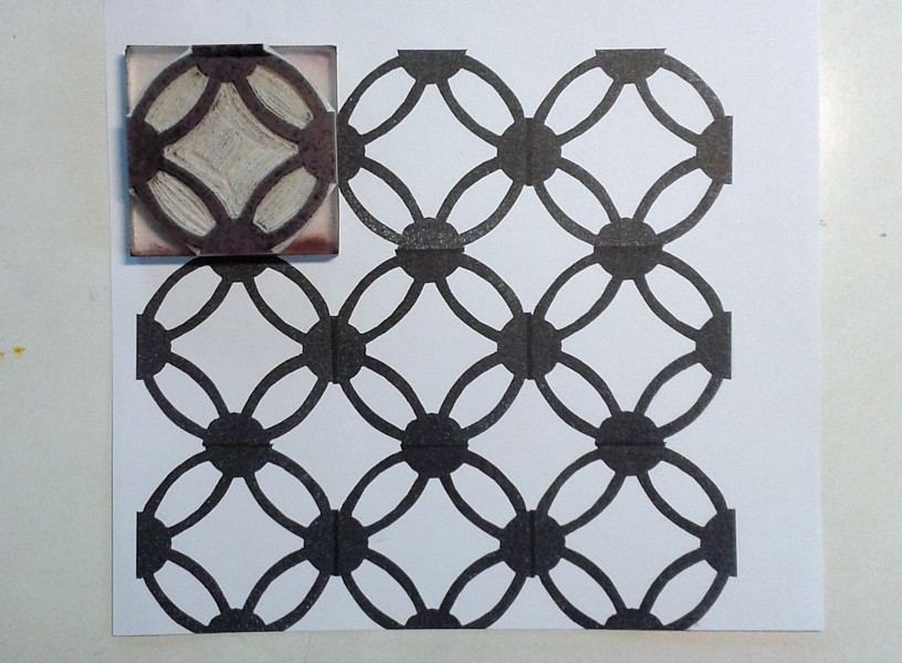


The reason I made both a stamp and a stencil was that I wanted to have a dialogue between darkness and light as well as positive and negative printing. In other words: my palette of choices for texturizing the background was to print with a colour that was darker or lighter than the base fabric and with a tool that let me print a positive image (the stamp: the motif has a different colour) or a negative image (the stencil: the background has a different colour). I used textile paint in both a thick and a thin consistency. Thick for printing, thin for spraying. The finished background looked like this. I knew the middle would be covered by the figure, so I didn't worry too much about that area.


The base layer was painted wet in wet with silk paints before I printed it, and I used a wooden frame to stretch the fabric prior to painting at that stage.

The background formed four main areas in my mind: shadow, light and two areas of transition.

The shadow

The transition from dark to light 

Light

Light defeating darkness

That was a bit of information about the background layer. Next time I'll show you how I painted the face and tell you a little about the quilting process.

Thanks for reading! See you again soon!

14 January 2014

Spray It, Don't Just Say It!

I'm teaching a class on spray painting on Thursday, and that inspired me to set up a spray painting studio in my kitchen today. Yes, you really do need to be generous with newspaper and whatever you use to protect your surroundings. I guarantee that the paint  will end up everywhere.


As for the fabric, this piece is a work in progress. I used a couple of new toys on it: a felt table topper and a stencil and mask I cut with a soldering iron.

In the Fall 2013 issue of Stitch magazine there are instructions for a really cute 'otomi-inspired knot bag', which I've been meaning to make for a while. After having suffered from severe lethargy most of the day, I finally got started on it.

I cut the pattern pieces, ironed freezer paper masks in place, and applied spray paint. Here the paint is drying. Pretty cool, but wait for the big reveal!


The drop cloth is starting to look interesting too!


And here it is, with freezer paper masks removed (sorry, but the light is really bad for photography this time of year):


In close-up:


And I'm definitely not going to throw away the freezer paper masks!


Now I only have to decide whether to embroider it like the one in Stitch magazine, or whether to just assemble it straight away. Whichever I decide, it's going to be a really fun little bag.

Thanks for dropping by, and see you again soon!

- Annika

6 May 2012

More Fun with Thickened Dye - and a brief explanation about thickened dye

One of my goals when I was on vacation recently was to explore Procion MX dyes in a variety of ways. I started by dyeing fabric with a low-water immersion technique (i.e. where you use just a small amount of dye instead of letting the fabric lie in a dye bath), and then I moved on to working with thickened dye. Some of my readers may be unfamiliar with the concept of thickened dye, so I'll explain it briefly. Thickened dye is simply a dye solution which has been thickened into a paste with the help of something like sodium alginate. Sodium alginate is made from seaweed, and mixed with water it turns into a gelly-like paste to which you add the dye. So why thicken dye and use that instead of fabric paint, you may ask? The main difference between fabric paint and thickened dye is that fabric paint lies on the surface of the fabric and stiffens it, whereas thickened dye is absorbed into the fibres, and when the excess dye and print paste is washed away, the fabric is just as soft as before. Depending on what effect you're after, you can work with either, or even both.

Today I want to share my experiments with direct dye painting and screen printing. I started my explorations into direct dye painting quite modestly by hand painting some x's on a monoprinted and sponge stamped fabric with a round brush.


After that I felt a bit bolder and made stronger marks with the brush, also on top of a monoprinted fabric.


The next thing I tried was to experiment with thicker and thinner dye. I kept adding water to the thickened dye while I was working, to see how thin I could make it before it became too thin. If the paint is too thick it's difficult to apply, but if it's too thin it'll spread too much on the fabric.


This rose was painted with thicker dye. It was pretty hard work to get the lines even.


This rose was painted with a very thin dye. It was easier to apply the dye, but as you can see, the lines are thicker and fuzzier than in the first rose.


The next sample was printed with a silkscreen over freezer paper bird shapes that I had ironed onto the fabric, and before I removed the masks I printed the surface with bubble wrap. After the masks were removed I filled in the details with thickened dye and a small brush. As expected, the lines that were painted on the dry areas inside the bird shapes wet on dry are crisp, whereas the ones I painted outside the birds wet on wet are fuzzier.


The next sample is only screen printed. It's an example of a positive print, where I've cut out a motif from ordinary printer paper and slid the paper with the tree-shaped hole under the silk screen and squeegeed thickened dye over the paper stencil.


I cut the tree out carefully with a craft knife and could use the tree shape as a mask and print a negative image too. I'm amazed at how crisp the lines are in these two prints. You wouldn't believe that these prints are made with a simple printer paper stencil, would you?


The printer paper stencil I used.


In this sample I used a commercial letter mask by Tim Holtz. Here I poured some purple dye over the screen before I pulled yellow pain with a squeegee. I love the effect!


In this last sample I dye painted a motif with a narrow flat brush. I did this sample last night and it is still batching. I enjoyed working with the flat brush, as I found it easier to make thick and thin lines with this brush than with the round brushes I tried earlier.


And that's all folks. I've put away all my dyeing utensils for now, and my little home is returned to order until the next time. Which I hope will be soon, because I've had a lot of fun and there's plenty more interesting things to try. So watch this space. ;-)

Thanks for reading this far, and I hope to see you again soon! - Annika