Showing posts with label Monoprinting. Show all posts

18 July 2014

Spring Into Action

I've been away from this blog for so long that I'm at a loss how to start again. So I'll just start with the most important thing that has happened this summer, apart from my move from Helsinki to Jakobstad (or Pietarsaari, which is the Finnish name for my new home town).

By the end of May I submitted my entry for the The Quilters' Guild Challenge at the Festival of Quilts in Birmingham this August. The National Guild in Finland, FinnQuilt, accepted my art quilt, and it was sent to Birmingham together with 15 other quilts. After the exhibition, it will go on tour for two years, and you can probably image how pleased I am about this. It's the first time that I've participated in anything like this, and it's all very exciting.

The theme this year is 'In My Garden', or the seasonal garden, and spring was the season that was given to Finland. As soon as I read about the competition and the theme I knew what I wanted to do. But since it's a competition and the Festival is still about three weeks away, I can't yet publish any images of my finished quilt. However, as I know there are people who are curious and eager to see what I've made, I'll post some sneaky images as a teaser.

In fact, I've already posted one sneaky image of a sketch in this blog entry. Here are a few more.

This piece of fabric was used to soak up extra paint while I was working on organza, and I realised afterwards that it was also the perfect fabric to use for the back of the quilt. Waste not, want not! I printed with crumpled paper, monoprinted with an acrylic block and spray painted through a plastic doily.


In a spring garden there has to be spring flowers, and you can probably make out which flower I chose, even though I'm just giving you a sneaky view from the back of the quilt.


And spring means the return of migrating birds. This is a part of the quilt that I'm particularly pleased with.


Thanks for visiting, and I hope to bring you more news soon!

9 June 2013

Poppy Love

After not having been very active on this blog for so long, it feels a bit difficult to get started again. What should I write? How should I start? Should I apologise to you, my reader, for my inactivity? Well, I think I'll just say that there's a time for everything, and a season for every activity under the heavens, and with so many things going on and such a big change in my life over the past year, blogging had to take second place. But I missed sharing my projects and discoveries with you, so I will make an attempt to breathe new life into this blog now. And I will start by sharing a little piece of quilt art that I finished recently.

I started working on this mini quilt in December, and I've shared a couple of process images before here. It was basically finished and part of an exhibition in January (link), but I wasn't 100 % happy with it, so it's been hanging around looking a bit forlorn since the exhibition, until I took pity on it and added what I felt was necessary. And now I'm quite pleased with it. I attached it to a canvas frame, which will make it easier to display, as well as make it look less like a little potholder on the wall and more like a proper piece of art.

Ok, enough talk. Here are the images:


The size of the mini quilt itself is 15,5 x 15,5 cm (6" x 6") and the techniques include monoprinting, stencilling, fabric markers, fabric collage, Free-motion machine quilting, hand embroidery and beading. The name of the quilt is Papaver (2013). Papaver is the Latin name for poppy.

Thanks for reading! More to come soon, because I'm bursting with projects and new things to try. :-)


10 March 2013

Busy Fingers

I've been busy again for a few weeks, following a visit to the dentist's, where I had my very last wisdom tooth removed surgically. Things were a bit slow chez moi afterwards, as my jaw was pretty sore, which meant that I've had a lot to catch up with. (I was a bit worried that the last of my wisdom would go with the tooth, but I've had a few clever ideas since, so I guess I'm safe...)

My fingers have been busy this weekend, as I'll be participating in a fair (Arbismarknaden) at the adult education centre next Friday. I'm selling handprinted and machine and hand embroidered items, such as the pretty purses you've seen on this blog before (here and here (the green purse is still unsold)), these little boxes (my very first blog entry!), and these coin purses I've been making this weekend:

The prints are made with a hand carved linoleum stamp I made myself.

I also made a couple of coin purses for a friend and myself. The print on these is a monoprint which I texturised with a handcut eraser stamp in the shape of a key:


I'll report back later about the fair, Until then, have a great week, and thanks for dropping by! - Annika

20 January 2013

News from Planet Sålunda

I hope the new year has started well for everyone. I spent the holidays in Larsmo (500 km to the north) with my parents and my adopted pet-sister Fia the Terri(fi)er. She made sure I got out of bed by bursting into my room almost every morning, and jumping into my bed.

When I got back it was time to start planning classes again, and to set up an exhibition, where I, together with three other teachers at Arbis (the adult education centre where I work), will exhibit our work until 26 January. Here's a photo of my corner of the exhibition:


The beautiful oil painting in the background is painted by Hanna Uggla, who's an art teacher at Arbis. Here's a link with information about who, where and when.

No sooner did the classes start than I was hit by a nasty cold. So I've been lying low, trying to cure myself. Not an easy task, as I'm a impatient patient. But since I wasn't strong enough for physical activities, I did some thinking instead; about what I did this past autumn, and how I could do things differently now, to make more room for myself and my friends and family. And this poor neglected blog! I was actively making things all autumn, but never found the time and energy to show you. Here's a sample of some of the printing I did for the fabric design class:


The samples include printing with hand-carved eraser stamps, softcut stamps and linoleum stamps, engraved foam stamps, glue stamps, found stamps, monoprinting and found stencils. I've been having fun while working like a horse! And there's more coming up. I love teaching this class.

And I finished the two Pretty Purses I showed you in my last blog entry:


The photos don't do them justice, as you can't really see the glitzy quilting in lilac-silver metallic thread on the top purse and violet-gold metallic thread on the bottom purse. But it'll give you an idea. Both these purses will be for sale at the Arbis Fair in March, where teachers will be able to show what they do and sell their products and artwork. So I need to warm up the sewing machine and get cracking!

Thanks for visiting, and see you again soon! - Annika

17 July 2012

Good Things Come in Threes

Here they finally are, my little pretty purses! And I'm pretty pleased with them, if I may say so myself.


Let me give you a couple of hot tips. There are two things that helped me accomplish three purses in a relatively short space of time. I designed these purses with a particular purpose in mind, you see, and I had little time to fuff about. I needed to be efficient.

As regular followers know, these purses are inspired by and based on the techniques Melanie Testa presents in her book Inspired to Quilt (please refer back to this post for more info). In the book Melanie uses thickened Procion MX dyes to design her fabrics. However, I felt I wanted to do things quick and dirty this time, without having to soda soak or batch fabric. So I used fabric paints. Fabric paints work very well for monoprinting, as long as you keep in mind that you are dealing with a medium that dries fairly quickly. Have a plan before you spread the paint on the printing plate, otherwise you will discover that most of the paint got stuck to the plate instead of the fabric. Fabric paint gives the fabric a slightly plastic feel, but with monoprinting it isn't as bad as I expected, as the layer of paint is very thin. What I appreciated most was that the paint dried quickly, so there was hardly any waiting time at all. I was surprised by and pleased with the result, and I have come to appreciate fabric paints more after this experience.

My second hot tip is to work in a series. I'm not particularly keen on doing the same thing over and over again, I get bored too easily, but working in a series definitely helps you to produce more art, as you don't have to "reinvent the wheel" with every new piece. You learn things with each piece, and can apply your insights immediately in the next piece, so there is educational value in it as well. And when the motif is fixed, as it is in this case, I was able to concentrate on other things, such as colour and pattern. I'm not planning to always work in a series from now on, but I've realised that it is definitely something worth considering every now and then.

Here are a couple of detail shots (I love the way the monoprint makes the bud look hairy - that was serendipity):


As these are purses, I wanted the insides to be just as neat as the outsides, so I used embroidery thread also in the bobbin. That also helped me to get rid of any problems with thread tension and unwanted bobbin thread creeping up to the front.


I also bound the edges on the inside and added my own tag.

The tag is made from a piece of cotton ribbon with an inkjet iron-on transfer print.

And that's my pretty purses! I had a lot of fun with these.

Thanks for visiting and see you again soon! - Annika

16 July 2012

Two More Pretty Purses

By now I've quilted all three pretty purses (please refer to this blog entry for more information about pretty purses, and images of the first purse I quilted), and I'm off to buy zippers. Before I dash off, however, I'll share process photos of the other two purses.

Pretty purse nr 2:

Printed cotton and silk organza 
The two layers aligned
and quilted

 Pretty purse nr 3:

Printed cotton and silk organza
 The two layers aligned
and quilted

Thanks for visiting! I hope to have images of the finished purses soon. - Annika

12 July 2012

It Started with a Stencil

If you follow this blog, you know by now that I recently participated in an online stencil workshop with Melanie Testa (Stencil Magic; there is a rolling admission, so you can still sign up!), during which I made my own stencils. Not a lot of them, but a few I really like. If you want to have a look at photographs of them, as well as descriptions of the inspiration and processes involved, hop over to my Flickr photostream.

I haven't been as active as I wanted to with my stencils, but as I said, I have made some stencils that I really like, and I'm thrilled that the course work has already started to pay off. At the moment I'm working on not one, but three little purses with my own stencilled imagery. I'm basically following Melanie Testa's processes for creating layered textile art, and pattern for a "pretty purse". I'll supply you with a list of sources at the end of this post.

First I took a piece of cotton and monoprinted it, and then I stencilled some nonsense script on it with one of the stencils I'd made. (I masked off part of the cotton with Magic/freezer paper).


Then I took a piece of silk organza and monoprinted that, followed by printing on the organza with my own poppy stencil. It doesn't look like much yet, but wait and see!


I added more printing on the cotton layer, and then I collaged a poppy over the printed cloth. The poppy isn't quite natural from this viewpoint, but it'll be alright in the end.


And this is what the layers look like together. In the background you can see the map I made as a guide.


And here the quilt sandwich is machine quilted, with a few hand embroidered details, and ready for the final steps: to cut out the purse shape, add a zipper and sew it all together.


And, as I said, I have two more purses on the go, so stay tuned. I will show you the finished purses quite soon, I believe. I'm ready to start quilting the other two tomorrow.

If you want to know more about the layering process and the pretty purse, check out these sources (all by Melanie Testa):

General process for creating layered textile art:
Inspired to Quilt

Pretty purses:
Inspired to Quilt
Quilting Arts Magazine issue 36 (December 2008/January 2009) (the link will take you to the digital edition of the magazine)
Quilting Arts TV, episode 304

Thanks for visiting, and please return soon for images of the finished pretty purses. I'm very excited! - Annika

6 May 2012

More Fun with Thickened Dye - and a brief explanation about thickened dye

One of my goals when I was on vacation recently was to explore Procion MX dyes in a variety of ways. I started by dyeing fabric with a low-water immersion technique (i.e. where you use just a small amount of dye instead of letting the fabric lie in a dye bath), and then I moved on to working with thickened dye. Some of my readers may be unfamiliar with the concept of thickened dye, so I'll explain it briefly. Thickened dye is simply a dye solution which has been thickened into a paste with the help of something like sodium alginate. Sodium alginate is made from seaweed, and mixed with water it turns into a gelly-like paste to which you add the dye. So why thicken dye and use that instead of fabric paint, you may ask? The main difference between fabric paint and thickened dye is that fabric paint lies on the surface of the fabric and stiffens it, whereas thickened dye is absorbed into the fibres, and when the excess dye and print paste is washed away, the fabric is just as soft as before. Depending on what effect you're after, you can work with either, or even both.

Today I want to share my experiments with direct dye painting and screen printing. I started my explorations into direct dye painting quite modestly by hand painting some x's on a monoprinted and sponge stamped fabric with a round brush.


After that I felt a bit bolder and made stronger marks with the brush, also on top of a monoprinted fabric.


The next thing I tried was to experiment with thicker and thinner dye. I kept adding water to the thickened dye while I was working, to see how thin I could make it before it became too thin. If the paint is too thick it's difficult to apply, but if it's too thin it'll spread too much on the fabric.


This rose was painted with thicker dye. It was pretty hard work to get the lines even.


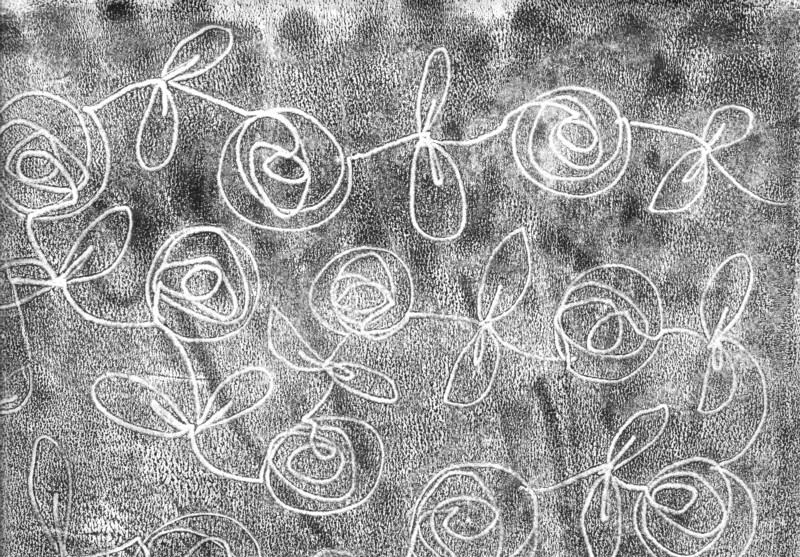
This rose was painted with a very thin dye. It was easier to apply the dye, but as you can see, the lines are thicker and fuzzier than in the first rose.


The next sample was printed with a silkscreen over freezer paper bird shapes that I had ironed onto the fabric, and before I removed the masks I printed the surface with bubble wrap. After the masks were removed I filled in the details with thickened dye and a small brush. As expected, the lines that were painted on the dry areas inside the bird shapes wet on dry are crisp, whereas the ones I painted outside the birds wet on wet are fuzzier.


The next sample is only screen printed. It's an example of a positive print, where I've cut out a motif from ordinary printer paper and slid the paper with the tree-shaped hole under the silk screen and squeegeed thickened dye over the paper stencil.


I cut the tree out carefully with a craft knife and could use the tree shape as a mask and print a negative image too. I'm amazed at how crisp the lines are in these two prints. You wouldn't believe that these prints are made with a simple printer paper stencil, would you?


The printer paper stencil I used.


In this sample I used a commercial letter mask by Tim Holtz. Here I poured some purple dye over the screen before I pulled yellow pain with a squeegee. I love the effect!


In this last sample I dye painted a motif with a narrow flat brush. I did this sample last night and it is still batching. I enjoyed working with the flat brush, as I found it easier to make thick and thin lines with this brush than with the round brushes I tried earlier.


And that's all folks. I've put away all my dyeing utensils for now, and my little home is returned to order until the next time. Which I hope will be soon, because I've had a lot of fun and there's plenty more interesting things to try. So watch this space. ;-)

Thanks for reading this far, and I hope to see you again soon! - Annika

4 May 2012

Fun with Thickened Dye

So now I've dyed all this fabric: 72 differently coloured skinny quarters in all. What do I do with them? The colours are yummy, but let's face it: it's a little boring with just flat colour.

In my last blog post I showed you a flour resist technique I tried on some of my hand dyed fabrics. Here is the next thing I tried: stamping, monoprinting and stencilling with thickened Procion MX dye. I even tried monoprinting with a little stamp. Anything I could think of. (And of course you could do all the things I describe below with ordinary fabric paint too.) Here's some of my favourite samples:


Monoprinting. The pattern is made with a sponge dauber. I really like this effect. You'll find an image of the sponge dauber I used when you scroll down.


Stencilling. I used the stencil I so painstakingly cut a while back. The stencil is really quite unwieldy and not an example of a good stencil, as it's nearly impossible to handle as it is. The shapes get tangled and it's a nightmare to work with. This time, however, I put it under a silk screen, which made the application of thickened dye a lot easier.


Monoprinting. The pattern in this monoprint is made with a cheap paint brush and a silicone paint shaper. This technique quickly became a favourite. You'll find an image of the paint shaper I used when you scroll down.


Monoprinting with a stamp. I should have explored this technique a little more than I did as it was great fun. I combined a simple square-shaped stamp with monoprinting. I applied thickened dye to the stamp and made marks on the surface before printing.


My favourite tools: the humble sponge dauber and a silicone paint shaper:


I've written a whole blog entry about the paint shaper before, when I discovered that it could be used for applying masking fluid on paper. Check it out here.

This is a sight that makes my heart sing:


But wait - there's more! I've also tried screen printing and direct dye painting with thickened dye, so stay tuned for that. I just need to wash the fabrics before I can show you the results.

Thanks for visiting my blog and see you again soon! - Annika

12 February 2012

Untried Thing No 2: Drawn Monoprints

I've wanted to try drawn monoprinting ever since I learned the technique from Laura Kemshall on Design Matters TV (DMTV) quite a while ago. I went out and got the necessary acrylic retarder but, as so often is the case, I didn't have time to try it immediately and forgot about it. When I went through my stash a few weeks ago I found two (!) different brands of acrylic retarder. Apparently I'd forgotten about the first one when I went out and got the second one. Not to worry, now I have two different brands to compare. I tried them both for my drawn monoprints.

You may be wondering what a drawn monoprint is. Well, it's a cross between a drawing and a monoprint. A monoprint is a print which you basically just pull once. Sometimes you can also get a second print, which is referred to as a ghost print. In short, to do drawn monoprints, you simply ink up a printing plate (a transparency or a sheet of Perspex/Plexiglass) with the help of a brayer or paint roller. You then float a sheet of paper or a piece of fabric on top and make marks with e.g. a skewer or pencil. The marks will transfer to the paper or fabric, along with the 'background noise' that is characteristic of this technique. The acrylic retarder is important if you want to use acrylic paint, as the paint otherwise dries too quickly for this technique. Fabric paint can be used as it is.

On paper I used Winsor & Newton acrylic retarder and Liquitex Slow-Dri blending medium with black acrylic paint and both worked well. The first brand, which was a lot thicker than the other one, gave a little drier print, whereas the Liquitex medium, which was more liquidy, gave a wetter and darker print, which seemed to work better for ghost prints. On fabric I used black fabric paint. The ghost prints I tried were more successful on paper than on fabric.

Drawn monoprint with acrylic paint and W & N acrylic retarder


Ghost print of the above print


Drawn monoprint with acrylic paint and Liquitex Slow-Dri blending medium


Drawn monoprint with fabric paint


Drawn monoprint with fabric paint


I love this technique. It's easy, perfectly addictive and gives great results. Try it!

Thanks for stopping by, and stay tuned for more Untried Things!