Showing posts with label Procion MX. Show all posts

20 November 2013

Mango & Raspberry Sorbet

It's a very dark and gloomy time of the year in this part of the world. The days are short and the trees are bare. "The sun is spent" (John Donne), "The sedge has wither'd from the lake, And no birds sing" (John Keats), and so on... We haven't had any snow yet to brighten things up, so I'm doing my best to brighten up my world with fabric and dye.

I've made some wonderful discoveries about the Emo dye that I often use, which have helped me get results that are similar to those I've had with Procion MX dye earlier. What a thrill it is to open up a fabric bundle and discover the glorious colour you were hoping for! I could hardly contain myself the other day, when I discovered a way of using Emo with ice cubes.

Below are a few images to feast your eyes upon.

If you want fractured patterns, you need to heat up your Emo dye, and not just leave it batching, as you can do with Procion MX dye. Two months ago I didn't know how to achieve this degree of texture with Emo:

 
And if you recall the unsuccessful shibori shrimp from two years back (I thought it was old dye, but it was really cold dye that was causing the problem), you'll be pleased to see that the shrimp is a lot spicier now. This is done with mokume shibori, and I've sewn the stitches in a spiralling shape.


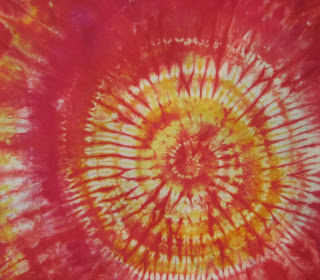
And the pièce de résistance, as far as I'm concerned, is this successful attempt at ice cube dyeing with Emo. Emo isn't overly fond of cold, but by putting the fabric bundle in a hot water bath instead of batching it on top of the fridge as I usually do with Procion MX dye, I got a wonderful result:


I love the combination of golden yellow and dark pink. Perhaps I should try to make it into a dessert: mango-raspberry sorbet? Yum!


Thanks for visiting and I hope to see you again soon!
- Annika

28 September 2013

I Can Dye Happy Now

One of the dyes that I frequently refer to on this blog is Procion MX dye. It's an easy and versatile dye that I enjoy using. There's just one problem: I can't find it in Finland. So I've looked at some of the dyes that are more easily available to me, and one that seemed well suited for the techniques that I have explored with Procion MX dye is a cold water reactive dye (based on Remazol) by the Finnish company Emo-tuotanto Oy. I have also mentioned this brand before on this blog.

To be honest, when I first started exploring the Emo dyes, I was rather disappointed. I did exactly what I did with the Procion MX dye, but I didn't get the effect I was looking for. What I got was something like what you see on the right, but what I really wanted is what you see on the left.


I assumed that the dye was so different from the Procion MX type that it just wouldn't work in the same way. However, after doing a bit of reasearch and making a few changes to the way I work, I have discovered that it is after all possible to achieve similar effects, and now I can dye happy.

First I did a 12-step gradation with the three primaries:


Then I did a 7-step gradation with a split complementary colour scheme:


And then I did a 5-step gradation with tints and shades:


And I love the results and the simplicity of my new method, which I'll get back to later. For now, I'll just let you feast your eyes on the rainbow that I have created. Looking at my stacks of ironed, neatly folded and colour co-ordinated hand dyes fills me with happiness and calm.


Yes, I was (am) one of those kids who will find great enjoyment and satisfaction in putting all the crayons and coloured pencils in the right order in the box.


The warm half of the rainbow


The cool half


Thanks for visiting!
- Annika

24 July 2013

Iced Parfait on the Menu

Today was supposed to be a sunny day, but something obviously went wrong in the weather department. So I'll keep my fingers crossed for tomorrow instead. Meanwhile, I'm going to share with you a cool technique I tried a few weeks ago on a sunny day: ice cube dyeing.

I followed Carol Ludington's directions for iced parfait in issue 57 (June/July 2012) of Quilting Arts Magazine. What you need is soda soaked fabric, ice cubes, fiber reactive dye in powder form and a tall container with a lid. Scrunch, pleat, fold or twist the fabric, and place it in the container. Add a layer of ice cubes and sprinkle dye powder on top of the ice cubes. Then add another layer of fabric, ice and pigment. There was room for three layers of fabric, ice and pigment in my container. This is what it looked like with all three layers:


A close-up
 
One more close-up, just because of the yumminess

At this point, when all the ice had melted, and there was a lot of muddy water in the container, it was time to feel a bit worried:

But there was no need for worry (top layer):
 
Ok, admittedly the middle layer is pretty wild:

The bottom layer, to my surprise, wasn't mud coloured:

Iced parfaits will definitely be on the menu again. ;-)

Thanks for stopping by, and more fun stuff soon! - Annika

9 July 2013

Summer Party with Confetti & Tea

There are so many fun things out there to try that I don't know where to turn. When I opened the June/July issue of Quilting Arts Magazine I immediately found three things I wanted to try. I've tried two of them now (confetti dyeing, and discharging soy wax resisted fabric), and I'm sure I'll try sand painting very soon. It's one big fabric design summer party at the moment.

Today I'll show you the results from the confetti dyeing I tried recently, as well as the beginning of some tea dyeing I was inspired to try after reading India Flint's book Eco Colour.

Confetti dyeing is a ridiculously easy and fun dyeing technique, if you have dye pigment in powder form. You soak a piece of cloth in soda solution, place the fabric on a surface, arrange the fabric into folds if you want to, and then sprinkle dry dye powder on top with the help of a mesh. Batch as normal, rinse and wash. For more detailed information on the technique, please refer to Carol R. Eton's article in the June/July issue (#63) of QAM, pages 26-28.

On the first sample I sprinkled Procion MX dye on a flat piece of fabric:


On the next sample I did exactly the same thing as in the first sample, but then I used a pipette to drip soda solution over the fabric. When the liquid spread over the fabric, it moved the dye around and created blurry starbursts:


On the third sample I pushed the fabric into folds before sprinkling on the dye:


Pretty wild stuff. Another reason I was very pleased to see that it worked was because I used some old dye that had been lying around for ages. I've heard that Procion MX dye shouldn't be kept too long, but at least these dyes have aged gracefully. There's definitely nothing wrong with the colour saturation here.

Finally, let me just show you a dyeing experiment in progress. I read the section on solar dyeing in India Flint's book and decided to try it there on the spot. So I made some tea with a bunch of old tea bags that I've saved for tea dying. Then I accordion folded a piece of fabric, and in the folds I snuck in more tea bags, this time a herbal tea that produces a red liquid.


I crammed the fabric into a glass jar, poured tea on top, sealed the lid and put the jar in a sunny spot. Now I -only- have to wait a month before I can pull out the fabric and see what's happened. Luckily I have a lot going on at the moment, so a month will pass in no time.


Thanks for visiting my blog! There will be more fun adventures in the world of fabric design soon.
- Annika


6 May 2012

More Fun with Thickened Dye - and a brief explanation about thickened dye

One of my goals when I was on vacation recently was to explore Procion MX dyes in a variety of ways. I started by dyeing fabric with a low-water immersion technique (i.e. where you use just a small amount of dye instead of letting the fabric lie in a dye bath), and then I moved on to working with thickened dye. Some of my readers may be unfamiliar with the concept of thickened dye, so I'll explain it briefly. Thickened dye is simply a dye solution which has been thickened into a paste with the help of something like sodium alginate. Sodium alginate is made from seaweed, and mixed with water it turns into a gelly-like paste to which you add the dye. So why thicken dye and use that instead of fabric paint, you may ask? The main difference between fabric paint and thickened dye is that fabric paint lies on the surface of the fabric and stiffens it, whereas thickened dye is absorbed into the fibres, and when the excess dye and print paste is washed away, the fabric is just as soft as before. Depending on what effect you're after, you can work with either, or even both.

Today I want to share my experiments with direct dye painting and screen printing. I started my explorations into direct dye painting quite modestly by hand painting some x's on a monoprinted and sponge stamped fabric with a round brush.


After that I felt a bit bolder and made stronger marks with the brush, also on top of a monoprinted fabric.


The next thing I tried was to experiment with thicker and thinner dye. I kept adding water to the thickened dye while I was working, to see how thin I could make it before it became too thin. If the paint is too thick it's difficult to apply, but if it's too thin it'll spread too much on the fabric.


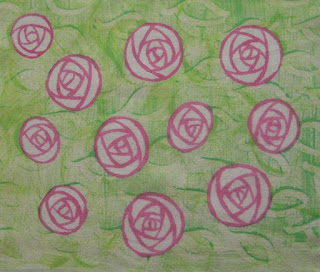
This rose was painted with thicker dye. It was pretty hard work to get the lines even.


This rose was painted with a very thin dye. It was easier to apply the dye, but as you can see, the lines are thicker and fuzzier than in the first rose.


The next sample was printed with a silkscreen over freezer paper bird shapes that I had ironed onto the fabric, and before I removed the masks I printed the surface with bubble wrap. After the masks were removed I filled in the details with thickened dye and a small brush. As expected, the lines that were painted on the dry areas inside the bird shapes wet on dry are crisp, whereas the ones I painted outside the birds wet on wet are fuzzier.


The next sample is only screen printed. It's an example of a positive print, where I've cut out a motif from ordinary printer paper and slid the paper with the tree-shaped hole under the silk screen and squeegeed thickened dye over the paper stencil.


I cut the tree out carefully with a craft knife and could use the tree shape as a mask and print a negative image too. I'm amazed at how crisp the lines are in these two prints. You wouldn't believe that these prints are made with a simple printer paper stencil, would you?


The printer paper stencil I used.


In this sample I used a commercial letter mask by Tim Holtz. Here I poured some purple dye over the screen before I pulled yellow pain with a squeegee. I love the effect!


In this last sample I dye painted a motif with a narrow flat brush. I did this sample last night and it is still batching. I enjoyed working with the flat brush, as I found it easier to make thick and thin lines with this brush than with the round brushes I tried earlier.


And that's all folks. I've put away all my dyeing utensils for now, and my little home is returned to order until the next time. Which I hope will be soon, because I've had a lot of fun and there's plenty more interesting things to try. So watch this space. ;-)

Thanks for reading this far, and I hope to see you again soon! - Annika

4 May 2012

Fun with Thickened Dye

So now I've dyed all this fabric: 72 differently coloured skinny quarters in all. What do I do with them? The colours are yummy, but let's face it: it's a little boring with just flat colour.

In my last blog post I showed you a flour resist technique I tried on some of my hand dyed fabrics. Here is the next thing I tried: stamping, monoprinting and stencilling with thickened Procion MX dye. I even tried monoprinting with a little stamp. Anything I could think of. (And of course you could do all the things I describe below with ordinary fabric paint too.) Here's some of my favourite samples:


Monoprinting. The pattern is made with a sponge dauber. I really like this effect. You'll find an image of the sponge dauber I used when you scroll down.


Stencilling. I used the stencil I so painstakingly cut a while back. The stencil is really quite unwieldy and not an example of a good stencil, as it's nearly impossible to handle as it is. The shapes get tangled and it's a nightmare to work with. This time, however, I put it under a silk screen, which made the application of thickened dye a lot easier.


Monoprinting. The pattern in this monoprint is made with a cheap paint brush and a silicone paint shaper. This technique quickly became a favourite. You'll find an image of the paint shaper I used when you scroll down.


Monoprinting with a stamp. I should have explored this technique a little more than I did as it was great fun. I combined a simple square-shaped stamp with monoprinting. I applied thickened dye to the stamp and made marks on the surface before printing.


My favourite tools: the humble sponge dauber and a silicone paint shaper:


I've written a whole blog entry about the paint shaper before, when I discovered that it could be used for applying masking fluid on paper. Check it out here.

This is a sight that makes my heart sing:


But wait - there's more! I've also tried screen printing and direct dye painting with thickened dye, so stay tuned for that. I just need to wash the fabrics before I can show you the results.

Thanks for visiting my blog and see you again soon! - Annika

24 April 2012

Artist's Block

I'm on vacation. I have big plans. I'm burning with eagerness to try everything I ever wanted to try. I should have all the time in the world. So what's happening? - Nothing! I've been suffering from the most awful artist's block. Since my last blog entry a week ago I've managed to finish a sock, cut out the muslin pieces for a wrap-around top (no sewing, though), dye two gradations (one which is still batching), try out a fun technique with paintstiks (which I will come back to when I've found a paintstik which isn't past its 'best before' date), and created a sad little square of surface designed fabric. Yes, I know I sound a bit despondent. I feel a bit despondent. I guess I was more in need of a vacation than I realised, and my body just put the foot down and refused to turn on the creative juices. So I just have to take baby steps. It's frustrating, but not the end of the world.

This is the first gradation I've dyed so far. A warmer colour scheme than the last one, with golden yellow, bright scarlet and medium blue (Jacquard Procion MX dye). Click the tags Gradations, Dyecation, Procion MX and Frieda Anderson for more information about gradations. A lighter gradation (gradation 2, i.e.) is ready to be rinsed out, so I'll show you that one in my next blog post. What I like about working with these gradations is that it makes me mix colours that I know I would never have mixed if I had just been doing it on my own. And to my surprise I've realised that those colours that I thought I considered "ugly" are really very useful and not ugly at all. Bright or muddy, light or dark, they all have and deserve a place in the fabric stash!

First gradation, medium value (they look a bit lighter in this photo)


I mentioned a 'sad little square of surface designed fabric'. Well, to be fair, it's really not that sad, but I was a bit disappointed with it, as it didn't turn out the way I expected. I'll walk you through the process. And if you want more details and inspiration check out Melanie Testa's great article Cut from your imagination. Resist-printing fabric with paper 'snowflakes' in issue 21 of Quilting Arts Magazine.

First I printed a hand dyed piece of fabric with bubble wrap and discharge paste:


Then I applied a Magic paper (freezer paper) 'snowflake' resist:


Here's the result after applying fabric paint (dark green, metallic green and gold):


You can see the problem, right? What I should have realised when I was applying the paint is that I was working with the background. I think I would have got away with it if I'd stopped after the metallic green paint, but I felt like adding a bit of glitz, and that was too much. The gold paint jumps forward and since it's similar in value to the the resisted leaves, it obscures the resisted pattern.

I spent some time mulling over the problem and going through different ways to solve it and save the fabric, and this is what I ended up doing: I grabbed a green Multimark pen and drew in the contours of the resisted motifs.


I'm not wild about it, but it's better, it works, and it taught me a valuable lesson about contrast. Something I'm wild about, however, is the snowflake:


If I don't use it as resist in another piece, I'll glue this one into my sketchbook. I love the metallic sheen on the paper.

Thanks for following my adventures in surface design. There's more to come soon. Flour-resist. That's all I'm saying. ;-)

Have a great week! - Annika

13 March 2012

Final Report From My Dyecation

I've been away from my blog for a while, as things got a little crazy here again. But now I'm back with a few final pictures from my dyecation. I still haven't shown you the third, dark gradation that I did after the medium and light gradations. I must admit that I didn't think I would like the dark colours, and thought they would be too murky and gloomy for my taste. But luckily I was wrong. This gradation produced some of the deep purples and plums that are my favourite colours to wear, and some beautiful petroleum blue.


 I was left with quite a lot of unused dye, which I used for overdyeing


black-on-white fabric...


and white-on-white fabric.


And here's a trick I learned from Melanie Testa (Inspired to Quilt):

- dyeing embroidery floss with the help of floss holders!


Doesn't that make you want to grab a needle?


And here's a week's worth of dyeing adventures:


These are among my favourite fabrics:


I'm having a short break from dyeing now, but I will soon continue with the warm gradation (golden yellow, scarlet and medium blue). Then I will soon need to come up with a way of using all my fabrics, because there isn't any more room in my tiny flat...

Thanks for dropping by and have a great week! - Annika