10 August 2016

Solar-Powered Fabric Design

I recently tried Jacquard Solarfast sunlight-developed dye for the first time, and after I published an image of the results on Instagram, I had a few questions about the process, so I thought I'd write a blog post about what I did.

Solarfast is a light-sensitive dye, which means that the colour develops when it is exposed to UV-light. You paint the dye onto fabric or paper, add some kind of resist that will block the light in certain areas, and then place it all in a sunny spot for about 10 minutes. During this time the exposed areas will react to the light and the colour will develop, whereas the areas in shadow will remain more or less unchanged, depending on how solid the resist is.

You could use objects and plants as resists, but I was interested in my own patterns and only used transparencies as resists. On one transparency I made a printout of one of my drawings with an inkjet printer - or in fact I made two printouts that I combined to make the dark areas more dense. The original drawing was a scanned line drawing, but I filled it with the bucket fill tool in my image-editing software.


On another transparency I drew a pattern with a black Posca paint pen. I'm sure other brands would work as well, but it is important that the ink is very solid, otherwise light will go through it.


On the last transparency I painted the same pattern but with black gesso and a brush.


According to the manufacturers instructions the dye has to be wet in order to work, but if it is too wet under a transparency there's a risk that condensation will form and interfere with the process. This is exactly what happened with my prints. Since I hadn't used the dye before it was impossible to know what is too wet, so I didn't worry too much about this. While developing the prints I could see condensation forming under the film, and how it would block the light in certain areas. But I could also see that this would not be a big issue for me, because the result was a beautiful mottled effect in a rusty brown colour. If you look closely at the images of the prints you will see brown (not fully developed) areas mixed in with the black (fully developed) areas. This is the result of condensation under the film. Here are the prints alongside the resists:


I really liked this process: it is simple, quick and has a lot of potential. Just imagine what you could do with photographs and scanned images of your own writing and drawings! The dye is ready to use (no more mixing toxic powders) and it comes in several different colours. I'm pretty sure this is a product I will return to again, because there is so much more to explore!

Thanks for visiting my blog and have fun printing in the sun!

30 April 2016

Happy Walpurgis Night!

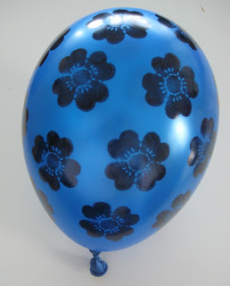
Here in Scandinavia we celebrate Walpurgis Night the day before May Day, and balloons are part of the celebration. I found some balloons in my stash and had the idea that perhaps I could doodle or paint on them. It was quite addictive and a lot of fun, and I couldn't stop after the first trial, so I ended up decorating them all in different ways. Here's the result:

I started with a mandala pattern with a thick marker pen.


Since the marker worked so well, I felt braver and tried a Posca paint pen next.


Then I did an allover pattern just in paint pen.


I started thinking about other media that might work on rubber and figured it was time to try alcohol markers and the Tim Holtz Spritzer Tool I recently invested in. I used a crocheted doily as a stencil.


And from alcohol markers it was only a short step to turn to solvent ink. I used a soft foam stamp and Staz On ink for this balloon.


Finally I thought about paint, and decided to try watered down gesso. That worked as well!


Here are the tools and media I used to decorate my balloons:


Pretty fun right? Now go forth my friend and decorate some balloons of your own! Thanks for visiting my blog and Happy Spring!


21 April 2016

May I present: Franka!

It's so satisfying to occasionally finish something from the UFO-pile. Those UnFinished Objects that for some reason always get pushed down to the bottom of the To Do-list by other projects or chores that seem more urgent. A quilt with the comic album heroine Franka has been one of those projects. I started it in 2011 and worked on it off and on for a while, but for some reason it ended up in the UFO-department. Just over a month ago I found it and decided to finish it this time.

If you want to have a look at the earlier blog posts about Franka, you can either click on the label Franka in the list to the right, or, if you prefer to see the entries one by one in chronological order from the first to the last, you can follow these links:

The story behind the Franka quilt
http://www.salundannika.blogspot.fi/2011/05/normal-0-false-false-false_29.html
http://www.salundannika.blogspot.fi/2011/06/normal-0-false-false-false_12.html
http://www.salundannika.blogspot.fi/2011/06/normal-0-false-false-false_22.html
http://www.salundannika.blogspot.fi/2011/07/things-are-cooking-in-my-kitchen.html
http://www.salundannika.blogspot.fi/2011/08/white-sand-for-franka.html
http://www.salundannika.blogspot.fi/2011/09/fire-festival-and-fun-with-franka.html
http://www.salundannika.blogspot.fi/2011/09/shes-smiling-now.html
http://www.salundannika.blogspot.fi/2011/10/flora-fauna.html

To be honest, I think this task might have been the one that put me off Franka at the time. I knew it would be a challenge to cut out the letters in the thought bubble, and to keep track of all the little bits that I had to save for the inside of the letters!


Another thing that worried me was the questions of how I should quilt it. Originally I had planned to quilt the background water in some way, but the more I thought about it, the more I hesitated. This is fused appliqué with a black fabric behind a very light fabric, so any mistakes would most likely result in tiny black holes/dots where the needle had penetrated the fabric. I was not willing to take that risk.


The solution was to only pin the quilt within the black outlines, and also to quilt it along the black edges. This means that the quilting doesn't really show from the front, and also that the fused appliqué is not stitched at all, only fused. This was another concern until I reached the conclusion that this is an art quilt, meant to only hang on a wall and perhaps never to be washed. The fusible web is a strong glue and it will hold everything securely in place for this purpose. Having reached this insight I was at peace and felt that I could finally finish my work.

There were a lot of thread ends to knot off as neatly as possible...


because the secret quilting is revealed on the back of the quilt:


I chose a facing as finishing method


And here she is: Franka!
Oh - It's even nicer than I thought... 

And here she is alongside with the original inspiration: a comics album heroine from the 1970's, drawn by Dutch artist Henk Kuijpers.


Thanks for visiting my blog!

19 December 2015

Paper Fabric Christmas Fun

One of the many materials that I enjoy working with is what I call paper fabric. It's not paper and it's not fabric, but a combination of the two. The basic technique is pretty simple: you saturate a piece of cotton with diluted PVA glue and then add papers to it. Thinner papers work best, and I like to combine papers that I've bought or found with papers that I've decorated myself.

A selection of tissue paper with stamped and hand drawn patterns


It's wise to prepare all the papers in advance, because the technique is quite messy and it's difficult to tear paper with sticky fingers...


The most difficult part is waiting for it all to dry...


A sheet of paper fabric ready to be used. It's difficult to describe: it's a bit like card stock, and a bit like artificial leather or plastic and a bit like birch bark. It's stronger than paper and you can sew it by hand or machine.


When I first started making paper fabric I used it mainly for card-making:


but later I've discovered all sorts of other uses for it. This time I set myself a challenge to use it for a variety of Christmas decorations.

I cut it into strips and made a Froebel star


As I realized that both the front and the back of the paper fabric would be visible, I painted the back with white acrylic paint. The star looks quite different when you turn it around.


I also made a woven heart basket, and realized that weaving thin strips like this is pretty challenging.

If you want to make life easier for yourself, you can skip the basket and make the heart two-dimensional instead.


This round little ornament is quick as well as cute.


But my favourite has to be the pod! (I made a pod last year too. Perhaps I should make a new one every year?)


I thought it'd be fun to make a filigree candle wrap too, but of course this is only for LED candles. I wouldn't want to start a fire!


And then I made a filigree ornament.


Finally, I made a little garland with hearts on a string


and festive bunting for the Christmas tree:


Of course you could use ordinary paper or card stock for these objects, but I think it's a lot more fun if you can use a material that you made yourself. I hope I've inspired you to make some festive decorations yourself!

Thanks for visiting my blog!

25 November 2015

Wonderful Light - The face and quilting

Yesterday I wrote about how I created the background for my quilt Ex Tenebris Lux. Today I’ll write about how I painted the face and quilted the piece.

I started by drawing the face with all its features in a smaller scale and worked on that until I was happy with how it looked. I then I enlarged the sketch to full scale and did some serious thinking about how to deal with the face in the quilt.


I decided to be brave and hand paint the face in quite a naturalistic style. In order to get an idea of a suitable colour scheme and colour placement, I copied the smaller sketch into a sketchbook and painted it with watercolour first as an exercise – going straight onto fabric would most likely end in a waste of time and paint. I knew that painting on fabric is very different from painting on paper or canvas, but still it turned out to be a great deal more difficult than I expected. Fabric soaks up paint eagerly, which means that you can’t really push the paint around much and create soft blending, and you run a risk of getting uneven coverage as the paint dries with a crisp edge in one area while you are working in another. You need to be quick when you paint larger areas. This was the first version of the head, before I painted the facial features. I used freezer paper for pattern transfer and to stabilize the fabric when I was painting, which is why the fabric looks wrinkly.


One of the greatest challenges was the colour of the face. I knew that paint lightens as it dries and that the silk organza that would form the final layer also would lighten the colour, so I had to take that into account as I was mixing the skin tone (no chance of finding a ready-mixed skin tone!). However, when the paint was dry I realized that the colour was too dark. I hadn’t taken into account that the first layer of paint needed to be very light, as it would form some of the lightest areas in the face and that I would add darker tones when I added shading. This is where I had my first moment of slight panic. I had spent so much time paiting the head. Would I have redo everything?

I slept on the matter and then it happened: the thing that I love as a creative person. The Solution. The Lightbulb Moment. The Eureka! I get such a rush from solving creative problems. I didn’t have to paint it all again: only the face! It’s fabric. It's appliqué. It’s all going to be covered up and smoothed out with organza. Everything can be fixed. So I painted another version of the face, cut out the hair and jacket from the old version and applied that onto the new face with the help of fusible web. How’s that for a facelift!


I then fused the whole head onto the background together with some falling ume (plum) blossom, and added more paint for highlights and golden light falling on the skin.


Now that everything was in place, it was time to paint the silk organza. I stretched it in a wooden frame and placed the frame over the face and the background, which I protected from drips and spills with plastic sheeting. The reason for this arrangement was that I could now see the quilt top underneath the organza and knew exactly where to paint. When dry, I also monoprinted a light texture for added interest.


I was now ready to start quilting. I was quite nervous about the face so after I’d sewn the outline of the profile and the ear, I continued with the hair decoration, hair and falling blossoms. And then I had my second moment of slight panic. How on earth would I quilt the face? I did a bit of research on how other quilt artists have dealt with faces, and came to the conclusion that I would not attempt any kind of realism here. No topographical lines, or shading with thread. Instead I would go for symbolism. I started with some simple patterns on the neck to feel my way, and when I was sure that I was on the right track I turned to the scariest part of the whole process. Quilting the face. I picked a leaf pattern and let it loosely follow the contours of the face. What a relief when the final stitches were in place!

I often use masking tape to as a stitching guide


After this everything else was, if not a piece of cake, then at least not as nerve-wracking. For the background I chose three themes for the quilting: the maru shippo pattern, the ume blossom and rays of sunlight. For me the quilting is just as important as the main motif in an art quilt and it should always add another layer to the story of the quilt.


As a final touch I like to finish with hand stitching as it adds yet another dimension to the quilt and creates life and depth.


I hope you enjoyed reading about my process even though this blog entry was very long. Making the quilt was also a very long process. I poured my heart and soul into it and therefore it feels wonderful that all my effort was recognized and rewarded.


Thanks for reading!