21 August 2011

I felt like needle-felting

This summer I’ve spent a lot of time decluttering my home and getting rid of stuff that I’ve collected over the years. Yesterday I found yet another place where I’d hidden away a bunch of papers that needed to be sorted out. I’m more and more convinced that I was a squirrel in an earlier life.

While sorting out the cupboard where I mainly keep my craft supplies, I found a small box with bits of wool that were the leftovers from a rather ambitious slipover project that I knitted some years ago. The yarn was so beautiful that I hadn’t had the heart to throw it away. In the same box I also found snippets of machine embroidery thread that I had saved ‘for something’. While pondering whether to throw away or save these treasures, I decided on a third option: to make them into something right away.

A number of years ago I experimented a bit with combining yarn and machine embroidery. My first experiment was inspired by a Swedish textile artist, AnnLis Krüger, who uses yarn in her humorous art quilts. Her technique was to wind a bit of yarn around her fingers, place it on a piece of fabric and free-motion stitch it in place. I tried this method, thought it was fun, but a bit tricky, as you had to watch your fingers carefully and be on the alert for loops that got caught around the embroidery foot. Here’s little quilt I made with this technique:


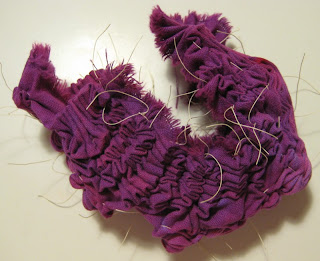
My next experiment was to loosely knit a piece of  fabric, place it between two sheets of water-soluble stabiliser and free-motion stitch the surface to flatten the fabric and lock the knitted stitches in place. That was a lot safer for the fingers and there was no risk of the foot getting stuck on loops. This is what the knitted and stitched fabric looks like:


The embellishers/needle-felting machines that are on the market now open up the possibilities for combining yarn and fabric further. When I did my earlier experiments, I’d hardly even heard of needle-felting, let alone of any needle-felting machines for domestic use. I don’t think that I will invest in an embellisher, but I have bought a handy little tool that is a kind of hand-driven mini needle-felting machine:


So when I found that leftover yarn, I decided it was time to put the needle-felting gadget to the test. I used a piece of craft felt as the base, put a generous amount of fibres (yarn and machine embroidery thread) on top and started punching away. It took me a quite a while to punch the fibres in place (a machine would definitely be a lot quicker), but as long as the project is small and you are equipped with a bit of patience it’s doable. When the fibres were relatively well attached, I took the fabric over to the sewing machine and free-motioned on top to secure everything in place.


I then took my needle-felted fabric pieces and made them into these cute little hearts:


I’d be happy to post instructions on how to make these hearts if anyone is interested. Just leave a comment or e-mail me, and I’ll include the instructions in a future blog post.

14 August 2011

White Sand for Franka

It's time for another Franka update.

Since I last wrote about Franka, I've been out hunting for fabric. I needed skin tones, a background fabric (i.e. for the water) and a better green than the one I had at home. It took me two trips to the fabric shop before I had a working combination. Not surprisingly, it was the water that caused me some trouble.

My first idea was to use a very light blue, preferably marbled, fabric for the water. I didn't find a suitable blue that was as light as what I had intended, but I found a slightly darker one that went very well with the other colours, which, after all, are pretty saturated. 

At home, though, I had second thoughts. The blue fabric is beautiful, but there is a problem: I'm a red person. The colours in the room where Franka will hang are dark red, burgundy, warm yellow, warm dark brown and white. Blue would look very out of place there. I did think of this before I went to the shop, but I sort of thought I'd get away with it... Lesson learned.

So it was time to put on the old Thinking Cap. And this is what I thought.

First I thought that I could make the wall hanging even more pop art-inspired, and use black and white for everything except Franka and the flowers. That would make them pop. I decided to try out the colour schemes with the help of a photo-editing software.

The original plan


The pop art plan


Then, suddenly, I realised that I had made a very silly mistake, assuming that water is blue. Water is, as we all know, colourless and takes its colour from the things it reflects or the things that show through it. It looks blue or grey when it reflects the sky. But when you stand in a foot of water on a Thai beach, looking down at your feet, the water is clear and what you see is cream coloured sand around your toes.

The way I imagine Franka is that she's floating in about a foot of water with sand made out of coral and sea shells under her. So I realised that a cream coloured background would make sense. It fits in with the scene, and also with my room.

The third colour scheme


So off I went to the fabric shop again, and I found the perfect fabric for what I have in mind. Today I drew the background on paper-backed fusible web and ironed it onto the fabric. Now I've reached one of the most critical stages in the whole project: cutting out the background fabric in reverse appliqué, and fusing it onto a black base fabric.

The fusible web is in place and I'm getting ready for some precision cutting...


Wish me luck!

12 August 2011

Further Adventures of the Shibori Shrimp

I'm not one to give up easily, so of course I couldn't stay away from the shrimp, even though I said there would be no more shrimps until I'd renewed my dyes. (For the earlier instalments of The Adventures of the Shibori Shrimp, look here and here.)

I had one - no, as a matter of fact, two - of those famous 'What If'-moments. What if I used fabric paint instead of dye? That could be interesting. And what if I, instead of measuring my string and making lots of tedious knots, threaded the needle with uncut thread, stitched from one side to the other, then made a U-turn and stitched back before cutting the thread. Then I would only have to tie one knot with the two loose ends, instead of four separate knots. 

Pretty clever, eh? 
(I'm pretty sure, too, that I'm not the first one who's thought of this.)


Shrimp No 3


Shrimp painted with metallic fabric paint 


The result


The fabric is actually starting to look quite interesting now. Perhaps I could have added a little more paint, but I quite like it as it is. It was a successful experiment. By the way, I did remove the thread while the paint was still wet, as I wasn't sure what would happen if it dried in a crumpled state. That's for future experimentation to find out.

From the shibori shrimp to another food-related topic: I had a very nice surprise earlier in the week when 'journalist, traveler, art and music lover' Joan Walters contacted me on Flickr to tell me she'd used the 'Can't Resist Thai Food' page that I made for The Sketchbook Challenge in May on a blog entry. Please use this link to have a look at my page and the other gorgeous food-related sketchbook pages that she used on the blog. Make sure to check out more entries too while you're there, as there is a lot of great artwork to be found!


5 August 2011

Shibori Shrimp

Do you remember the little shibori shrimp that I prepared earlier? If not, please refer back to this post if you’d like to refresh your memory.

I had hoped to show you some really neat shibori-dyed fabric by now, but to be honest, things have not exactly worked out the way I planned.

It started well enough with the little shrimp, but when I applied dye to it, things started going wrong. I soaked the shrimp in soda ash solution (=fixative) according to the instructions, and started painting it with dye. As soon as I put brush to shrimp, though, I suspected that the result might not be what I had intended, because the fabric just soaked up the dye like a sponge.

Shrimp soup


I suspected that there would be very few white areas left after batching.

I was right


I’d mixed too much dye, so I used the leftovers for marbling another piece of fabric. I used the old ice cream tub method.

Marbled fabric


To return to the shrimp, I figured that the problem was a combination of moist fabric, thin dye solution, soft fabric and not tightening the strings enough. So I decided have another try with the same piece and a darker colour.

Shrimp number two


This time I didn’t soda soak the shrimp, but used thickened dye with soda ash added to the print paste instead. I figured that the dry cloth in combination with thick dye would stop the pigments from migrating too far into the fabric.

Shrimp stew


I was right, but…
 

This time something went wrong in the dyeing process. This is supposed to be overdyed with dark blue, so as you can see, the colour is very weak compared to the purple. The question is now: did I use too little soda ash, or are my dyes getting old? Perhaps both. It is a couple of years since I bought them, and I’ve read somewhere that they have a shelf life of approximately two years, so I think it’s probably time to use them and get new ones.

Again, I managed to mix more dye than I needed, so I did some monoprinting with the leftovers on fabrics that I’d dyed and discharged earlier, but wasn't happy with.

This one became my favourite.


There’ll be no more shrimps now until I’ve renewed my dyes. But rest assured, I’ve not given up. I will try it again, and succeed.

31 July 2011

Back To Reality

Today was my last day of vacation, and it's back to the old grinding stone tomorrow. I'm pretty content, though, as I did manage to check off most of the items on my 'Want To Do' List. I've scrubbed and decluttered my flat, and got rid of a lot of useless stuff that I've collected over time. I suspect I was a squirrel in a past life, but this ex-squirrel will just have to learn new tricks now.

I've also tried shibori, gelatin printing, deconstructed printing and and a little bit of this and that. I will blog about some of these things within soon. Just stay tuned.

One of the things that makes me most happy is that I managed to stick to my plan to draw an object every day - without cheating even once! I spent about 45 minutes to 1.5 hours on these drawings and paintings, so I won't be able to continue in the same whay now that I'm back to work. There simply isn't time for it. However, I'm thinking I should devote one evening a week to drawing like this, to practise my eye and hand coordination. And another thing that I need to pracise is to regularly draw simple quick sketches that don't necessarily need to be very realistic or serious. For that I'm going to seek help from Carla Sonheim. I bought her book Drawing Lab for Mixed-Media Artists, which I hope will help me relax and let myself be silly when I'm drawing. In general I'm pretty good at being silly, so I don't know why it's so hard when it comes to drawing

Here are some of my 28 drawings. You can find them all here


I did my drawings on 7 A4 sheets that I folded in half. The reason for using loose sheets was that I knew I wanted to use paper of different quality, and also that sketchbooks intimidate me. I'm going to bind these sheets into a little book later. I found this a liberating way of working. Single sheets were also easy to carry with me on my travels.

28 July 2011

Deconstruction

At Uni I once took a course on deconstruction, which dealt with the poststructuralist theories of Jacques Derrida, Jacques Lacan and Julia Kristeva. I completed the course, but I was probably more confused after the course than before it. And I’ve been slightly suspicious of the word ‘deconstruction’ ever since. Perhaps I’d understand it better today if I gave it another chance.

However, since Tuesday the honour of the word ‘deconstruction’ has been restored. I finally tried deconstructed or breakdown printing. This printing technique, which was developed by Kerr Grabowski, is fun, easy, exciting, surprising and not least forgiving, which I’ll explain below. I’ll walk you through the basics of the process with illustrations.

You start by applying thickened Procion MX dye to a silk screen. Thickened dye is a dye solution which has been thickened with a sodium alginate mixture. It has to be dye, because you’re going to leave it to dry, so if you use paint, you’ll ruin your screen. After the dye has been applied to the screen you place textured objects over the dye and leave everything to dry. I applied a very thick layer, so it took almost three days before it was completely dry.

The screen is prepared with dye and textured objects and drying


 When the dye has dried and you've removed the objects you’re ready to start printing


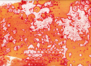
For printing, you will again use a sodium alginate mixture, with or without dye solution. The mixture functions as a release paste for the dried dye on the screen. The release paste moistens and releases the dry dye little by little, so every print has a new pattern. I used red dye for preparing the screen and yellow dye in the release paste. This is the result:

The first print


The third print


The fifth print


I’m really please with the results. I had some difficulties, but I found that the technique is very forgiving. The mistakes I made would probably have ruined the print with another technique, but with deconstructed printing you hardly notice them.

First of all I discovered that the well on my screen was too narrow and didn’t allow enough print paste to cover the whole printing area. I was too greedy when I prepared the screen with duct tape and thought that the bigger the screen the better. Not so. I need to add more duct tape to enlarge the well. If there’s not enough room for the amount of print paste you need for the print, you’ll run out before you reach the other side, and that may ruin your print. But, as I said, with this technique this is not a huge problem. There are white areas where the dry dye has resisted the print paste, so the places where white areas formed because there wasn’t enough print paste are hardly noticeable. Still, I will definitely enlarge the well on my screen.

This well is much too narrow


The other problem I experienced was that I had applied too thick a layer of thickened dye when I prepared the screen. First, the dye took forever to dry and, secondly, there were still after many pulls big clumps of dye on the screen that refused to be deconstructed. I had to work quite hard to get them off, and then they formed big lumps on the fabric instead. However, these lumps created very intense colour, so perhaps it wasn’t so bad after all. But it did feel like a waste of good dye. I'll try a thinner layer of dye next time and see what happens.

I really enjoyed this technique and will definitely try it again. It’s cool. It’s hot. It’s yummy!

26 July 2011

Things Are Cooking in My Kitchen

After a rather slow start, I’ve really got into swing with my experimentations now. Some have been successful, others less so. I wrote before that I’d like to try shibori, deconstructed (breakdown) printing and gelatin printing. By now I have tried them all and will report back in due course. Before that I’ll just share a few other projects that are already finished or in progress.

Softsculpt


This is a material that you heat up with e.g. an iron and then press onto/into an object or surface. The material retains the shape when it cools. However, if you’re not happy with the form or texture, you can reheat the Softsculpt to flatten it again, and redo the imprint. I have had this material for three years without trying it, until two days ago, when I finally was inspired. I probably spent an hour searching my flat for things that could be used for stamp-making (e.g. a vegetable brush, a piece of wood, a Christmas ornament, a quilting ruler, a candle-holder…). I haven’t yet tried the stamps, though.

Angie’s Fall


Perhaps you remember that I was very careful when I removed the stencil that I used for the pillow? One evening I was standing with it in my hand, wondering about how to store it, when I got an idea. It would make a great print on a t-shirt. So I picked out a t-shirt that I’d planned to print on and got cracking. I used the fabric paints that I bought in Edinburgh. Very luxurious result: they’re all metallic paints. Yum.
(And: I managed to remove the stencil without ripping it, so I’ll probably be able to use it one more time.)

Franka


I had planned to hunt for fabrics for Franka as soon as my vacation started, but I got busy with other things instead. Yesterday I had a rummage in my stash and came up with some yummy fabrics that I think will work. Here you see her top and skirt. But I still need to go on a hunt for water and skin tones. I’m excited, but slightly apprehensive. Those shapes will be a challenge to handle. Thank goodness for paper-backed fusible web. Without it this wouldn’t be possible.